Callyn Shoppe
Pots and Pans Organizer for Cabinet Tier Pot Organizers Rack with 3 DIY Methods, Adjustable Pan Organizer Kitchen Organization
Pots and Pans Organizer for Cabinet Tier Pot Organizers Rack with 3 DIY Methods, Adjustable Pan Organizer Kitchen Organization
Regular price
$44.99 USD
Regular price
$0.00 USD
Sale price
$44.99 USD
Shipping calculated at checkout.
Quantity
Couldn't load pickup availability
SPECIFICATIONS
8-tier storage rack: Black Metal
Assembly Required: Yes
Brand Name: NONE
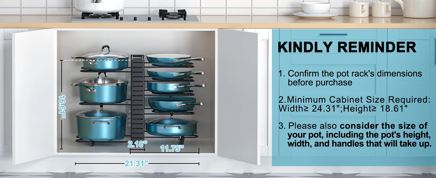
Feature: Adjustable Size
Frame Material: Metal
Function: Rust Resistant
High-concerned chemical: none
Is stain resistant: Yes
Material: Iron
Origin: Mainland China
Type: Storage Holders & Racks
Use: Kitchen
.aplus-v2 .container-with-background-image {
width: 100%;
height: 100%;
background-repeat: no-repeat;
background-size: cover;
}
width: 100%;
height: 100%;
background-repeat: no-repeat;
background-size: cover;
}
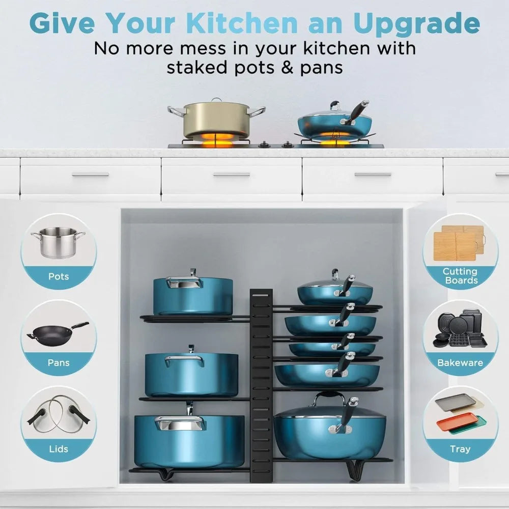
8-Tier Pot and Pan Organizer – Tame Kitchen Chaos
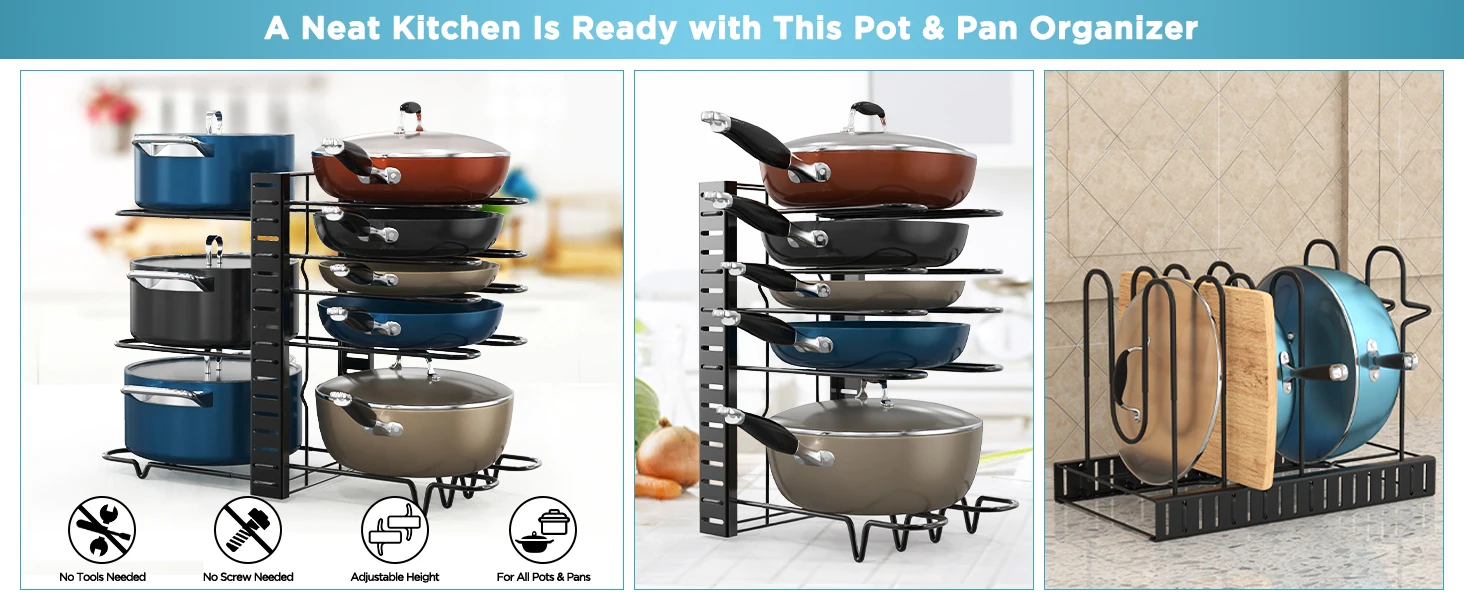
The favor of Social Media Influencer--8 Tier Pots and Pans Orgnaizer
-
Pan to An Organized Easy
-
Was Easy to Set Up
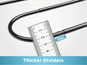
Upgraded From 4.0mm To 5.0mm
Material upgraded!
1.0mm thicker dividers, much more durable and stable than the old on the market. Each tier is can hold weight within 10lbs.
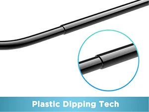
New Plastic Dipping Tech
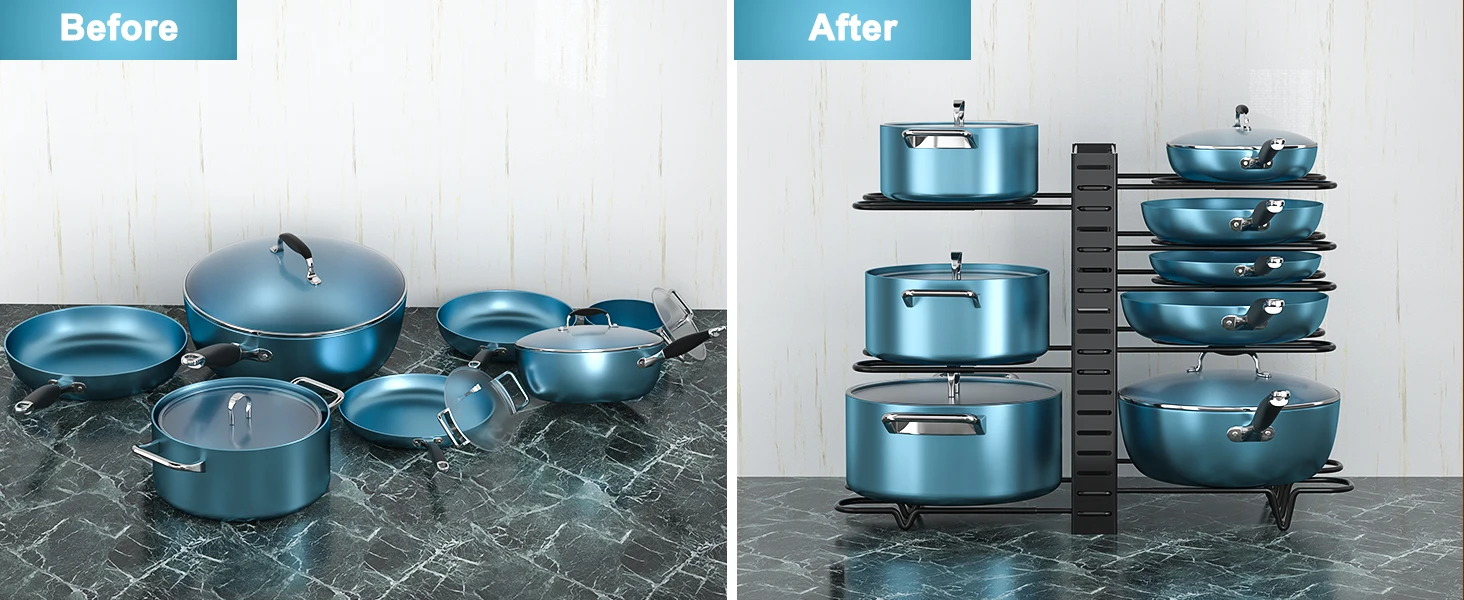
A Big Different After Using This Cookware Organizer for Cabinets!
.aplus-v2 .container-with-background-image {
width: 100%;
height: 100%;
background-repeat: no-repeat;
background-size: cover;
}.aplus-v2 .apm-brand-story-carousel-container {
position: relative;
}
.aplus-v2 .apm-brand-story-carousel-hero-container,
.aplus-v2 .apm-brand-story-carousel-hero-container > div {
position: absolute;
width: 100%;
}/*
Ensuring the carousel takes only the space it needs.
The sizes need to be set again on the absolutely positioned elements so they can take up space.
*/
.aplus-v2 .apm-brand-story-carousel-container,
.aplus-v2 .apm-brand-story-carousel-hero-container {
height: 625px;
width: 100%;
max-width: 1464px;
margin-left: auto;
margin-right: auto;
overflow: hidden;
}
.aplus-v2 .apm-brand-story-carousel-hero-container,
.aplus-v2 .apm-brand-story-carousel-hero-container > div {
height: 625px;
}.aplus-v2 .apm-brand-story-carousel.a-carousel-container {
padding: 0px;
}
/*
This centers the carousel vertically on top of the hero image container and after the logo area (125px).
Margin-top = (heroHeight - cardHeight - logoAreaHeight) / 2 + logoAreaHeight
*/
.aplus-v2 .apm-brand-story-carousel .a-carousel-row-inner {
margin-top: 149px;
}
/*
Cards need to have a width set, otherwise they default to 50px or so.
All cards must have the same width. The carousel will resize itself so all cards take the width of the largest card.
The left margin is for leaving a space between each card.
*/
.aplus-v2 .apm-brand-story-carousel .a-carousel-card {
width: 362px;
margin-left: 30px !important;
}
/* styling the navigation buttons so they are taller, flush with the sides, and have a clean white background */
.aplus-v2 .apm-brand-story-carousel .a-carousel-col.a-carousel-left,
.aplus-v2 .apm-brand-story-carousel .a-carousel-col.a-carousel-right {
padding: 0px;
}
.aplus-v2 .apm-brand-story-carousel .a-carousel-col.a-carousel-left .a-button-image,
.aplus-v2 .apm-brand-story-carousel .a-carousel-col.a-carousel-right .a-button-image {
border: none;
margin: 0px;
}
.aplus-v2 .apm-brand-story-carousel .a-carousel-col.a-carousel-left .a-button-image .a-button-inner,
.aplus-v2 .apm-brand-story-carousel .a-carousel-col.a-carousel-right .a-button-image .a-button-inner {
background: #fff;
padding: 20px 6px;
}
.aplus-v2 .apm-brand-story-carousel .a-carousel-col.a-carousel-left .a-button-image .a-button-inner {
border-radius: 0px 4px 4px 0px;
}
.aplus-v2 .apm-brand-story-carousel .a-carousel-col.a-carousel-right .a-button-image .a-button-inner {
border-radius: 4px 0px 0px 4px;
}.aplus-v2 .aplus-review-right-padding {
padding-right: 0.1rem;
}.aplus-v2 .aplus-review-right-padding {
padding-right: 0.1rem;
}.aplus-v2 .aplus-review-right-padding {
padding-right: 0.1rem;
}.aplus-v2 .aplus-review-right-padding {
padding-right: 0.1rem;
}.aplus-v2 .aplus-review-right-padding {
padding-right: 0.1rem;
}.aplus-v2 .aplus-review-right-padding {
padding-right: 0.1rem;
}.aplus-v2 .aplus-review-right-padding {
padding-right: 0.1rem;
}
width: 100%;
height: 100%;
background-repeat: no-repeat;
background-size: cover;
}.aplus-v2 .apm-brand-story-carousel-container {
position: relative;
}
.aplus-v2 .apm-brand-story-carousel-hero-container,
.aplus-v2 .apm-brand-story-carousel-hero-container > div {
position: absolute;
width: 100%;
}/*
Ensuring the carousel takes only the space it needs.
The sizes need to be set again on the absolutely positioned elements so they can take up space.
*/
.aplus-v2 .apm-brand-story-carousel-container,
.aplus-v2 .apm-brand-story-carousel-hero-container {
height: 625px;
width: 100%;
max-width: 1464px;
margin-left: auto;
margin-right: auto;
overflow: hidden;
}
.aplus-v2 .apm-brand-story-carousel-hero-container,
.aplus-v2 .apm-brand-story-carousel-hero-container > div {
height: 625px;
}.aplus-v2 .apm-brand-story-carousel.a-carousel-container {
padding: 0px;
}
/*
This centers the carousel vertically on top of the hero image container and after the logo area (125px).
Margin-top = (heroHeight - cardHeight - logoAreaHeight) / 2 + logoAreaHeight
*/
.aplus-v2 .apm-brand-story-carousel .a-carousel-row-inner {
margin-top: 149px;
}
/*
Cards need to have a width set, otherwise they default to 50px or so.
All cards must have the same width. The carousel will resize itself so all cards take the width of the largest card.
The left margin is for leaving a space between each card.
*/
.aplus-v2 .apm-brand-story-carousel .a-carousel-card {
width: 362px;
margin-left: 30px !important;
}
/* styling the navigation buttons so they are taller, flush with the sides, and have a clean white background */
.aplus-v2 .apm-brand-story-carousel .a-carousel-col.a-carousel-left,
.aplus-v2 .apm-brand-story-carousel .a-carousel-col.a-carousel-right {
padding: 0px;
}
.aplus-v2 .apm-brand-story-carousel .a-carousel-col.a-carousel-left .a-button-image,
.aplus-v2 .apm-brand-story-carousel .a-carousel-col.a-carousel-right .a-button-image {
border: none;
margin: 0px;
}
.aplus-v2 .apm-brand-story-carousel .a-carousel-col.a-carousel-left .a-button-image .a-button-inner,
.aplus-v2 .apm-brand-story-carousel .a-carousel-col.a-carousel-right .a-button-image .a-button-inner {
background: #fff;
padding: 20px 6px;
}
.aplus-v2 .apm-brand-story-carousel .a-carousel-col.a-carousel-left .a-button-image .a-button-inner {
border-radius: 0px 4px 4px 0px;
}
.aplus-v2 .apm-brand-story-carousel .a-carousel-col.a-carousel-right .a-button-image .a-button-inner {
border-radius: 4px 0px 0px 4px;
}.aplus-v2 .aplus-review-right-padding {
padding-right: 0.1rem;
}.aplus-v2 .aplus-review-right-padding {
padding-right: 0.1rem;
}.aplus-v2 .aplus-review-right-padding {
padding-right: 0.1rem;
}.aplus-v2 .aplus-review-right-padding {
padding-right: 0.1rem;
}.aplus-v2 .aplus-review-right-padding {
padding-right: 0.1rem;
}.aplus-v2 .aplus-review-right-padding {
padding-right: 0.1rem;
}.aplus-v2 .aplus-review-right-padding {
padding-right: 0.1rem;
}